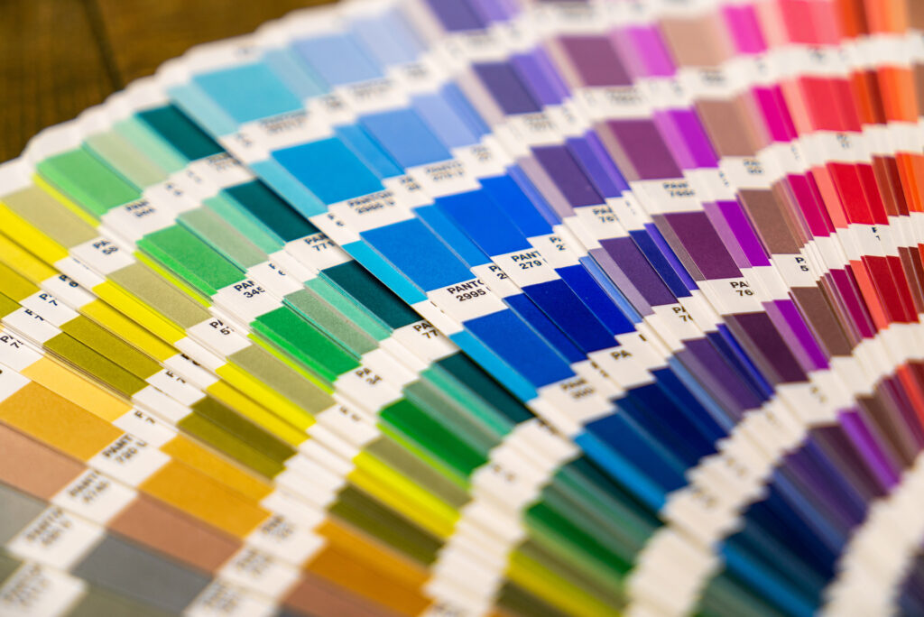
From the earliest advertisements to today’s digitally optimized branding strategies, color has been critical in shaping brand recognition and conveying specific messages to target audiences. Throughout history, brands have used color theory to bolster identity, influence emotions, and connect with consumers over time.
Color theory’s application in marketing revolves around understanding how colors trigger psychological responses. Color psychology, a field that studies how colors can affect human behavior and emotions, suggests how colors can evoke specific feelings and associations, impacting consumers’ decisions even when consciously unaware. Studies like assessments on the Geneva Emotion Wheel (GEW), which investigates the extent to which color and emotion are comparable, further support this. However, these findings are nothing new. The impact of color has historical roots dating back to the early 19th century and beyond. Then, during the Industrial Revolution, color prints and packaging to distinguish products using advanced printing technology popularised, creating a rise in distinct brand identities.
In general, colors like red have often been found to spark excitement and urgency, making them popular in clearance sales. For example, Coca-Cola, one of the earliest brands to adopt color to their logo, chose a red and white palette in the 1890s. Remaining consistent with the combo, red has become a part of the brand’s identity. The classic color of the bottles and ads catches the eye of possible consumers, helping the brand stand out from competitors. Even as the rest of the branding evolves, creating new variations of the classic flavor, Coca-Cola has consistently maintained its red hue, bolstering how a brand can use color to build a lasting, familiar image that continues to connect with an evolving and changing audience.
Another instance of color branding is how Tiffany & Co. has rebranded a color to evoke a specific feeling. The luxury jewelry label debuted its famous “Tiffany Blue” in 1845 with its first “Blue Book” catalog. The color, a frosty robin’s-egg blue, created an air of exclusivity. Additionally, due to the popularity of the shade, Eau de Nil, at the time, which was favored especially by European royalty, the color exudes luxury, calmness, and elegance. Tiffany Blue is now permanently linked to the brand, appearing in the wallpaper of the stores, jewelry dust bags, stationary, and occasional pop-up shops. It is important to note that Tiffany & Co. is not the only brand using blue. Blues express tranquility and trustworthiness, appealing to financial institutions and healthcare like Oral-B, BlueCross BlueShield, American Express, Chase, and more.
There’s also the strategic use of the absence of color. Apple’s approach to color branding has been relatively minimalistic, designed to convey sophistication, technology, and modernity. Although initially using a rainbow logo from 1977 to 1998, signaling innovation and diversity, in the late 1990s, Apple shifted to a monochromatic silver logo, aligning with its sleek, minimalist aesthetic and focusing on sophistication and purity. Apple products like the iMac and iPhone have played with colorful variations. Still, its main branding remains minimalist, creating an aspirational lifestyle image that suggests functionality, innovation, and high-end quality.
The strategic use of color is more critical than it may seem, especially in the context of digital marketing. With the advent of data-driven insights and user preferences, brands can now track consumer engagement with specific colors on websites, apps, and social media. This adaptability of color theory in an increasingly visual world reassures us that color will continue to be a silent yet powerful communicator, evolving with the changing landscape of branding and marketing.
Works Cited
Huynh, Robert. “Colour Story: Tiffany Blue -.” Glaciermediadigital.ca, June 2021, blog.glaciermediadigital.ca/index.php/2021/06/01/colour-story-tiffany-blue/.
Nikolic, Jovan. “How Did Coca-Cola Take Over by Playing on Emotions and Color.” Predict, 26 Jan. 2024, medium.com/predict/how-did-coca-cola-take-over-by-playing-on-emotions-and-color-03e241bd3a92.
Shuman, Vera, et al. “(PDF) Geneva Emotion Wheel Rating Study.” ResearchGate, Aug. 2015, www.researchgate.net/publication/280880848_Geneva_Emotion_Wheel_Rating_Study.
The Coca-Cola Company. “Coca-Cola Red: Our Second Secret Formula.” Www.coca-Colacompany.com, www.coca-colacompany.com/about-us/history/coca-cola-red-our-second-secret-formula.
“The Geneva Emotion Wheel – Swiss Center for Affective Sciences – UNIGE.” Www.unige.ch, 29 June 2016, www.unige.ch/cisa/gew/.
Tiffany & Co. “Tiffany Blue.” Tiffany, 2024, press.tiffany.com/our-story/tiffany-blue/.


